
Is Your Website a Brochure or a Salesperson?

Your website probably looks good. It likely has professional photography; a clean layout; a section with headshots and a mission statement; a projects gallery with your best work; and a contact page with a phone number and a form.
It’s polished and respectable. But it’s almost certainly not generating leads.
Most construction websites are built to inform. They tell visitors what your company does and show them what you’ve built. But informing isn’t the same as converting. A website that informs is a brochure, while a website that converts is a salesperson. And the difference between the two is costing you more than you think.
The 10-Second Test
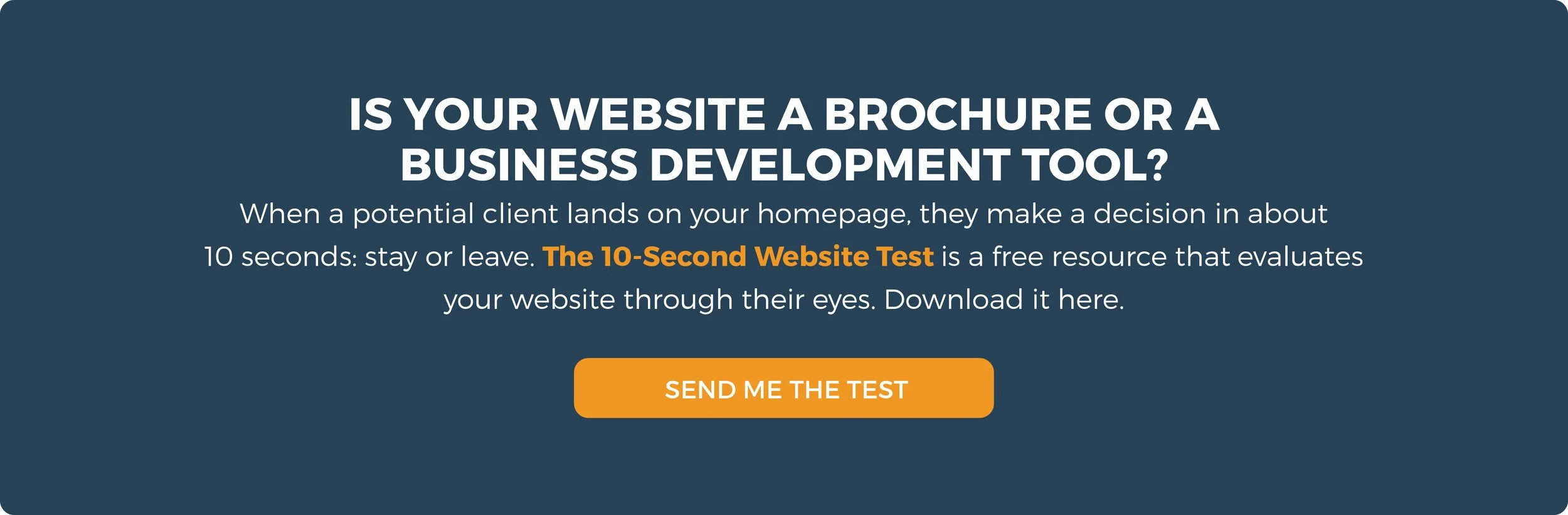
When a potential client lands on your homepage, you have roughly 10 seconds before they decide to stay or leave. In those 10 seconds, they’re asking three questions:
1. Who do you serve?
Not “what do you do,” but who do you serve? A facility manager looking for a renovation contractor needs to know immediately that you work with people like them. A developer evaluating general contractors needs to see that you understand their world. If your homepage speaks to everyone, it speaks to no one.
2. What problems do you solve?
This is where most construction websites fail completely. They list services like pre-construction, general contracting, design-build, and construction management, but they never articulate the problem those services solve for the client. Services are features; problems are what people actually care about.
The difference sounds like this: “We provide pre-construction services” vs. “We eliminate budget surprises before the first shovel hits dirt.” You’re highlighting the same capabilities, but it’s a completely different impact on the visitor.
3. Why should they choose you over the other companies they’re evaluating?
This is the differentiation question, and it’s the one that most construction websites don’t even attempt to answer. If your website could belong to any of your competitors with a logo swap, it’s not differentiating you.
Most construction firm websites fail all three of these questions. They describe the firm instead of speaking directly to the visitor. They list capabilities instead of solving problems. And they look interchangeable with every other construction company in the market.
The “Contact Us” Problem
Here’s a revealing exercise: go to your website right now and look at every page through the eyes of a first-time visitor. On each page, ask yourself: What is the visitor supposed to do next?
On most websites, the answer is the same on every page: “Contact Us.” That’s it. The only action a visitor can take is to pick up the phone or fill out a generic form. There’s no middle ground between “just browsing” and “ready to talk to someone.”
Think about what that means. A facility manager finds your website while researching contractors for an upcoming renovation. They’re still in the research phase so they’re interested but not ready to talk. They browse your services page, look at a few projects, and maybe read your team page. Then they leave because there’s nothing for them to do except contact you, and they’re not ready for that yet.
That visitor is gone. They may come back, but probably not. By the time they’re ready to talk, they’ll have found three other companies who gave them a reason to engage earlier in the process.
The Contact Us page is the weakest call to action because it only works for visitors who are already at the bottom of the funnel—people who have already decided they’re ready to talk to a contractor and move forward with a project. It completely ignores the much larger group of visitors who are earlier in their decision process. Those visitors need a reason to engage that doesn’t require a commitment and most construction websites give them nothing.
Compliments Are Not Conversions
“We get a lot of compliments on our website.”
This is something construction leaders say with genuine pride, and it’s understandable. A good-looking website feels like an accomplishment. But compliments and conversions are completely different things. Your colleagues, your employees, and your existing clients telling you the website looks great is not the same as the website generating new business.
A website’s job isn’t to impress people who already know you—its job is to convert people who don’t. Those two objectives require very different online approaches. A website built to impress focuses on the company: our history, our team, our projects, our awards. A website built to convert focuses on the visitor: your challenges, your goals, how we solve your specific problem, and what you should do next.
The distinction is subtle but the impact is enormous. One approach makes the firm feel good about itself while the other generates revenue.
The Invisible Cost
The cost of a website that looks good but doesn’t convert is almost impossible to see. It’s measured in visitors who leave without taking action. You never know who they were, what they were looking for, or what would have kept them engaged.
But consider the math. If your website gets 500 unique visitors per month (a modest number for a commercial construction company), and your conversion rate is effectively zero because the only CTA is “Contact Us,” you’re losing 500 potential touchpoints every month. Even if only 2% of those visitors were qualified prospects—people actively researching firms like yours—that’s 10 qualified visitors per month (120 per year!) who came to your door and left empty-handed.
How many of those 120 people ended up hiring a competitor? How many of them would have engaged with your company if you’d given them a reason to share their contact information?
You’ll never know.
And that’s exactly the point. The cost of a brochure website isn’t what you spent building it, but rather the business you’ll never know you lost.
Story Time
We once had a client whose website was visited by a massive amusement park (think a rodent with big ears). They were looking for a contractor who could handle the scope of their project and the complicated phasing required to stay open to the public. Not seeing anything that addressed their needs, they left and ended up working with a competitor.
By sheer luck, our client found out about the website visit and was able to ask why they weren’t approached for the project. The answer they got was “We didn’t think you could handle it.” Even though the client had handled multi-phase projects just like it and would have been the perfect company for the job, their website was a brochure and not a salesperson. Because they didn’t properly showcase the challenges solved and speak directly to their ideal visitors, that single website visit cost them millions of dollars.
You never know who is disqualifying you from your website alone.
The Brochure vs. Salesperson Comparison
The difference between a brochure website and a salesperson website isn’t about technology or design. It’s about intent.
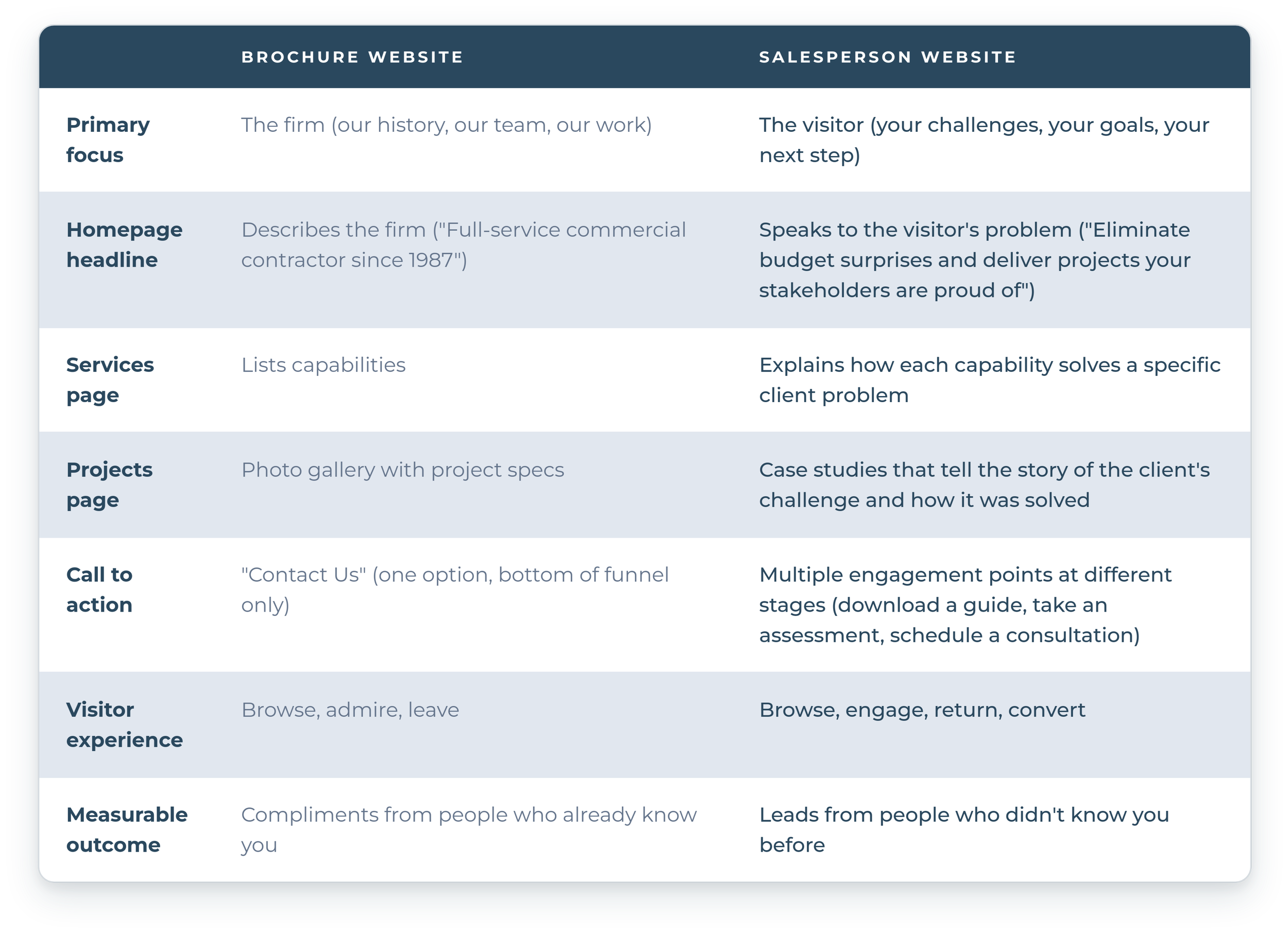
Most construction websites sit firmly in the left column. Moving to the right column doesn’t require a complete redesign. Rather, it requires a shift in thinking from “what do we want to say about ourselves?” to “what does our ideal client need to hear?”
The Question Worth Asking
Your website is either working for you or it isn’t. It’s either generating qualified conversations with potential clients or it’s sitting there looking professional while visitors come and go without a trace.
The question isn’t whether your website looks good. The question is whether it’s doing its job.